Storytelling through Colors: The Psychology of Visual Narratives
In the dynamic world of digital marketing, storytelling rules supreme. Its enduring appeal has spanned centuries, and color represents an often overlooked yet crucial ingredient for a successful narrative. Colors wield an incredible power to elicit emotions, communicate messages, and amplify visual storytelling. Our article delves into the psychology of color and how it can be leveraged to create captivating and impactful content.
The Importance of Color in Visual Narratives
The influence of colors on human psychology and perception is remarkable. They possess the ability to evoke emotions, spark recollections, and create connections to specific notions. Utilizing colors tactically can effectively elevate the storytelling experience, increasing the impact and memorability of content.
- The Power of Warm Colors
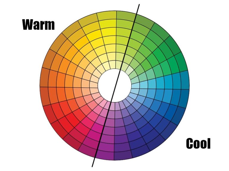
Discover the Power of Warm Colors in Visual Narratives. Red, orange, and yellow shades are renowned for their energizing and stimulating effects. They generate a powerful sense of excitement, urgency, and passion, making them perfect for grabbing the viewer’s attention. Incorporating warm colors into your visual narratives can help you evoke strong emotions and connect with your audience in a more meaningful way. For example, a vibrant red background can create an urgent, high-energy atmosphere, while an orange hue can spark enthusiasm and creativity. Unleash the captivating potential of warm colors in your next project and make a lasting impact!
- The Subtlety of Cool Colors
Utilizing cool colors such as blue, green, and purple can have a calming and soothing impact while promoting feelings of tranquility, trust, and dependability. The incorporation of such colors can lead to a more peaceful visual narrative. For example, a blue color scheme can inspire trust and reliability, rendering it an effective choice for brands operating within the finance or healthcare industries.
- The Intrigue of Neutral Colors
Neutral colors like gray, brown, and beige have the power to elevate any space to a new level of sophistication and elegance. With their versatility and timeless appeal, they create a beautifully understated backdrop that allows other design elements to shine. Whether you’re going for a minimalistic look or exuding a sense of professionalism, neutral colors are an essential part of any design toolkit.
Color Combinations and Contrast
Combining or contrasting different colors can produce truly magical results. By expertly utilizing color combinations, we can create a sense of harmony, balance, or tension within visual storytelling. A solid understanding of the principles of color theory is key to making purposeful design choices when crafting a narrative.
- Complementary Colors
Complementary colors, situated directly across the color wheel, provide a stark contrast and can catch the viewer’s attention. When paired together, colors like blue and orange or red and green can create a composition that exudes visual impact, making it a powerful choice for design projects.
- Analogous Colors
Analogous colors sit side-by-side on the color wheel, resulting in a pleasing and cohesive visual experience through shared tones. This color scheme can foster a sense of unity in visual stories. A combination of blue and purple shades can, for instance, provide a relaxing and peaceful atmosphere.
- Monochromatic Colors
Discover the elegant and cohesive effect of monochromatic color schemes. By incorporating various shades, tints, and tones of one single color, a harmonious visual story is effortlessly told. Achieve depth and dimension by expertly balancing lightness and darkness within the content.
Cultural and Contextual Considerations
Colors possess cultural and contextual meanings, which can differ among diverse regions and societies. Therefore, it is essential to keep in mind the target audience and their cultural background while selecting hues for visual narratives. By comprehending the cultural connotations linked with various colors, we can guarantee that our content effectively connects with the intended audience.
Western cultures associate the color white with purity and innocence, while some Eastern cultures view it as a symbol of mourning. In contrast, the color red is considered lucky and a sign of prosperity in Chinese culture, but can be interpreted as a danger or warning in other contexts. By understanding these cultural nuances, we can personalize our visual storytelling to create a more meaningful and relatable experience for our intended audience.
Conclusion
Utilizing colors in visual storytelling is an effective way to connect with audiences emotionally and convey messages with impact. By skillfully combining warm, cool, and neutral colors while also being mindful of cultural context and color theory, we can create compelling and resonant content that captivates our viewers. The power of color is not to be underestimated!
In digital marketing, captivating storytelling is essential, and colors are the powerful tools that bring our stories to life. By understanding the psychology of colors and exploring various combinations, your content can break through the digital noise and leave a lasting impression on your audience. So, let your brand’s story shine with the help of strategic color choices.

